Wiki
Clone wikidendsort / Home
Welcome
Hello and welcome to the wiki page for dendsort R package. On this page, you will find:
- motivation and rationale for developing this package
- step-by-step guide to install and use
- examples
If you have any question, comments, or share your stories, please feel free to email me at ryo[dot]sakai[at]esat[dot]kuleuven[dot]be!
Update
- version 0.2.0 is released.
- One of the key changes is the attribute for dendsort() function. To specify type of sorting, it used to be defined by the isAverage boolean attribute, but it has changed to type character attribute. By default it is now sorted based on the smallest distance value, but if you want to sort by the average distance, you need to pass type="average" when calling the function.
- See the help page of the dendsort package for more details.
Motivation and Rationale
This work stems from my love-and-hate relationship with heat map visualization: it is a compact and intuitive representation, while the use of color to encode continuous values has its limitations and sometimes suffers from unwanted artifacts. As Gehlenborg and Wong writes [1], the utility of heat maps fundamentally relies on the choice of color scheme and the meaningful reordering of the rows and columns. This R package tackles the latter challenge.
The ordering of observations and/or attributes is typically determined by hierarchical (agglomerative) clustering with a certain dissimilarity measure and a linkage type. The result of clustering is represented in a form of binary tree, known as dendrogram. Each observation is treated as its own cluster, and pairs of clusters that are most similar to each other are merged, until all of the observations belong to one cluster. Hierarchical clustering reorders items based on their similarity and the hierarchy of fusions are encoded in a dendrogram.
For N observations, there are N-1 merges and 2^(N-1) possible ordering of nodes in a dendrogram, because the orientation of two clusters at each merge can be swapped without affecting its meaning. The algorithm used in the default hierarchical clustering method in R is deterministic, resulting always the same structure given the same dataset, however, it can be further optimized to improve the readability and interpretability.
Method
There are 3 types of merge in hierarchical clustering: a leaf and another leaf, a leaf and a cluster, and a cluster and another cluster. Figure 1 shows a simple two dimensional data, illustrates how the dendrogram is constructed in R and introduces our sorting method.
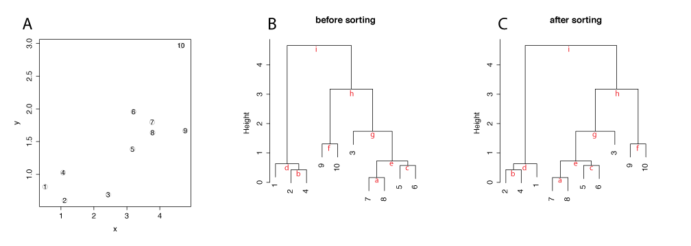
In the default hierarchical clustering in R (hclust), when a leaf merges with another a leaf, the orientation of items is based on the order of items in the input data, as seen at a,b, c, and f. When a leaf merges with a cluster, a leaf is placed on the left side, as seen at d, and g. When a cluster merges with another cluster, the cluster with lower distance/height is placed on the left side, as seen at e, h, and i. This is the default method in R and results a dendrogram drawn in B.
The sorting method in this package reorders the dendrgram generated by the default method, starting from the trunk of the tree (i). The default reordering is by the average distance of clusters. The cluster with a lower average value is placed on the left side. For example, the cluster d has a lower average distance than the cluster h, the cluster d is placed on the left. When a cluster is compared agianst a leaf, the leaf/observation is always placed on the right, as seen at d and g.
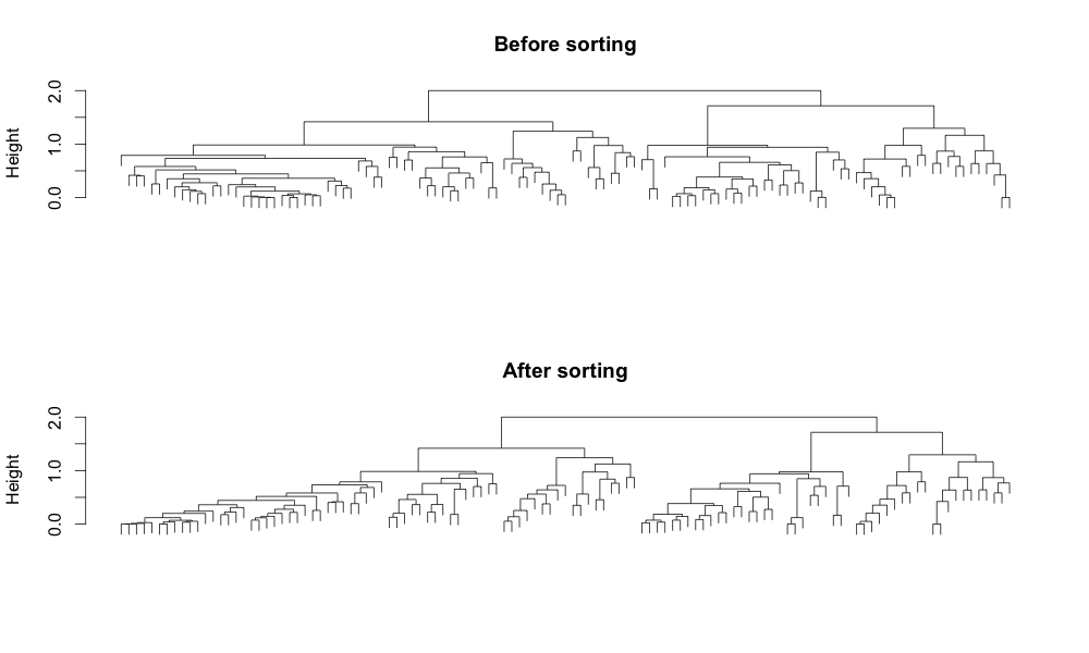
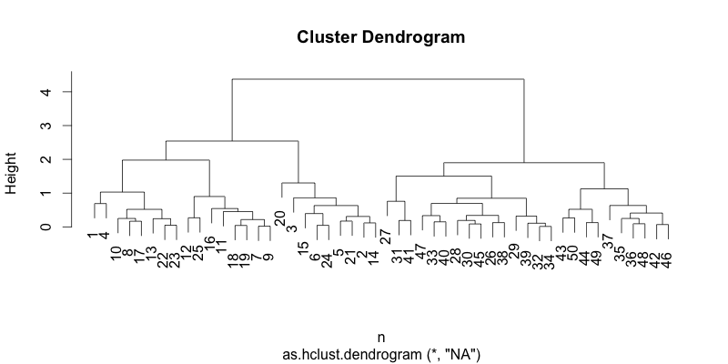
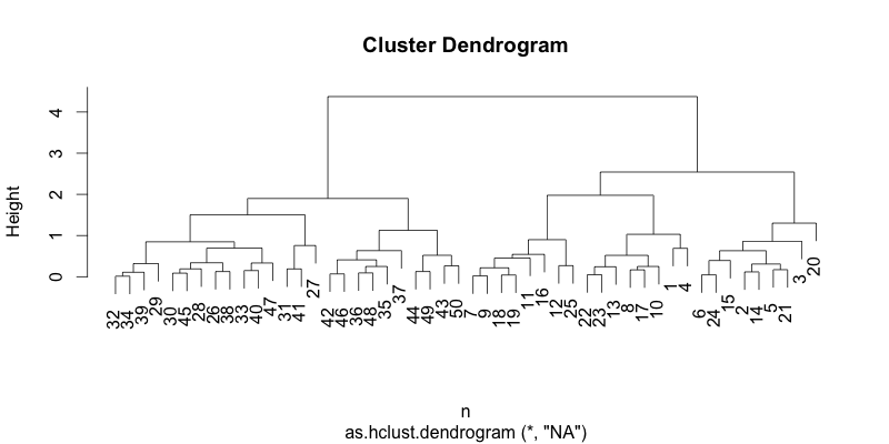
The result of sorting becomes more apparent when compared with a dataset with more observations. The figure below shows the hierarchical clustering result of 117 observations using a correlation-based distance and the complete linkage. The hierarchical structure in the dendrogram becomes more readable and interpretable by introducing the left to right order based on the distance. In addition, it reduces the ink usage by 5%, improving the data-ink ratio.
How to install
Make sure that you have installed R on your computer. For the instruction, please go to the website.
Once you have R running, download the dendsort package from CRAN:
#!r
install.packages("dendsort")
#!r
library("dendsort")
The main function in this package is dendsort(). And there are 3 attributes. The first one is either a dendrogram object or hclust object. The last two attributes are optional logical attributes:isReverse and byAverage.
Let's start with generating a sample data.
#!r
set.seed(1234)
x=matrix(rnorm(50*2), ncol=2)
x[1:25, 1] = x[1:25, 1]+3
x[1:25, 2] = x[1:25, 2]-4
#!r
plot(x)
#!r
hc= hclust(dist(x))
#you can try different linkage method, which produces different dendrogram structures
#hc.average = hclust(dist(x), method="average")
#hc.single = hclust(dist(x), method="single")
Let's see what the dendrogram looks like before sorting.
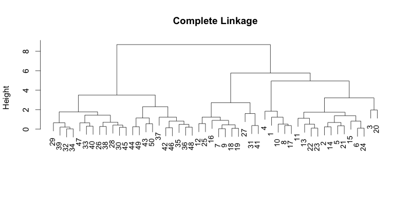
#!r

plot(hc, main="Complete Linkage", xlab="", sub="", cex=0.9)
Now, let's see what it looks like when you sort them by the average distance. dendsort() function can take the hclust or dendrogram as input. Here, we are just simply going to pass the hclust object.
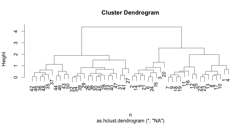
#!r
hc_sorted = dendsort(hc, type="average")
plot(hc_sorted)
You can reverse the ordering by passing a logical attribute, isReverse=TRUE.
#!r

hc_sorted = dendsort(hc, isReverse=TRUE, type="average")
plot(hc_sorted)
You can also sort a dendrogram based on the smallest distance in the cluster. Instead of average distance, it compares the smallest distance within the subtree. You can just pass a character attribute type="min", or no attribute, since the default is by the smallest distance from Version 0.2.0.
#!r
hc_sorted = dendsort(hc, type="min")
plot(hc_sorted)
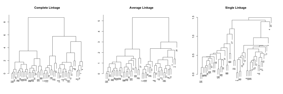
Comparing different linkage types
It is often recommended to test different linkage types to see if clustering yields the similar set of clusters. (The result of hierarchical clustering is affected by choosing a subset of observations.) However, dendrograms obtained from different setting can appear quite different, thus very difficult to compare. Here, we apply sortings to improve node orders, then it becomes more comparable.
Let's generate a dataset and apply hierarchical clustering with different linkage settings.
#!r

#generate sample data2
set.seed(1234)
x=matrix(rnorm(50*2), ncol=2)
x[1:25, 1] = x[1:25, 1]+3
x[1:25, 2] = x[1:25, 2]-4
#different linkage types
hc.complete = hclust(dist(x), method="complete")
hc.average = hclust(dist(x), method="average")
hc.single = hclust(dist(x), method="single")
So, if you just plot the result above, it looks like this...
#!r

par(mfrow=c(1,3), mar=c(3, 3, 5, 3))
plot(hc.complete, main="Complete Linkage", xlab="", sub="", cex=0.8)
plot(hc.average, main="Average Linkage", xlab="", sub="", cex=0.8)
plot(hc.single, main="Single Linkage", xlab="", sub="", cex=0.8)
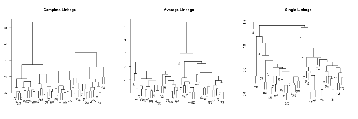
Complete linkage and average linkage results more or less comparable results, but the single linkage looks quite different... It is pretty hard to point out tight clusters, or even point out some outlier. For example, observations 32 and 34 merges at very low height/distance, but difficult to identify in complete and average linkages. So, let's try sorting. We will first sort based on the average distance, which is default.
#!r

par(mfrow=c(1,3), mar=c(3, 3, 5, 3))
plot(dendsort(hc.complete, type="average"), main="Complete Linkage", xlab="", sub="", cex=0.8)
plot(dendsort(hc.average, type="average"), main="Average Linkage", xlab="", sub="", cex=0.8)
plot(dendsort(hc.single, type="average"), main="Single Linkage", xlab="", sub="", cex=0.8)
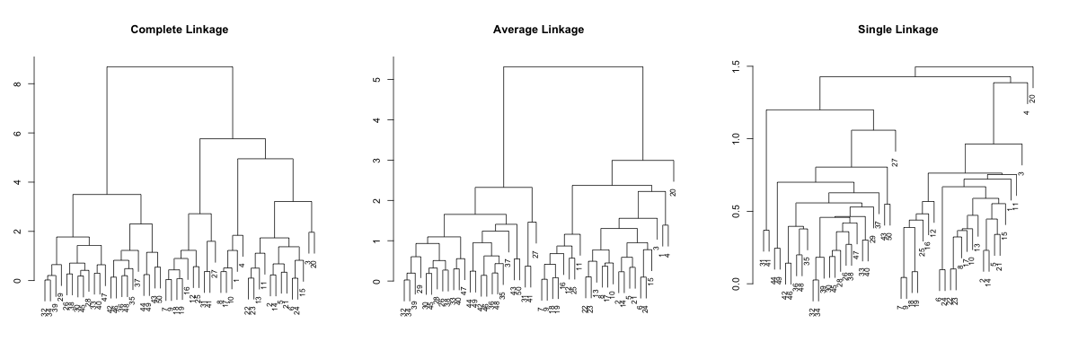
OK,it is somewhat better, but the single linkage is still not really readable. So, let's try sorting by the smallest distance.
#!r
par(mfrow=c(1,3), mar=c(3, 3, 5, 3))
plot(dendsort(hc.complete), main="Complete Linkage", xlab="", sub="", cex=0.8)
plot(dendsort(hc.average), main="Average Linkage", xlab="", sub="", cex=0.8)
plot(dendsort(hc.single), main="Single Linkage", xlab="", sub="", cex=0.8)
Now you can spot some patterns between these dendrograms. This sorting is done without affecting the meaning of the dendrogram, but I hope you agree that it is much more readable. Especially with single linkage example, the hierarchy in the result is more interpretable. I think...
Examples
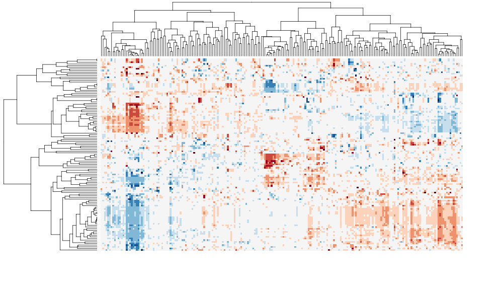
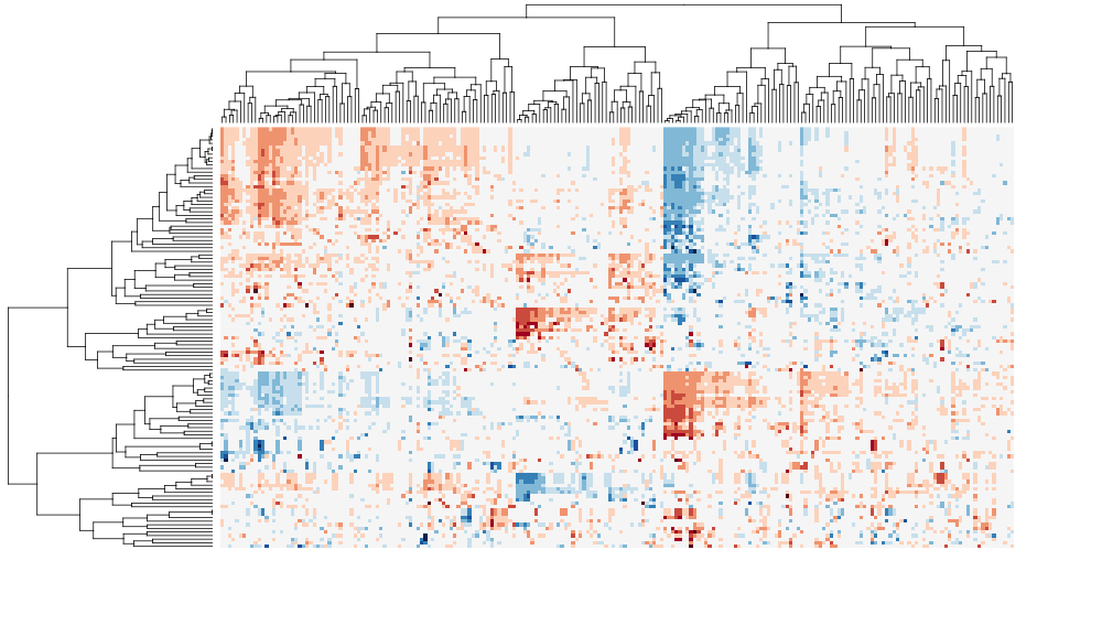
I have tested this package with other popular packages such as heatmap.plus and pvclust. I will post more examples, but for now, I can post two biclustering heatmap images, before and after sorting. As demonstrated by following examples, sorting the dendrogram can improve the intepretability and readability of cluster heat maps in exploratory data analysis, as well as for publication.
TCGA
The following cluster heat maps are generated using a multivariate table from the integrated pathway analysis of gastric cancer from the Cancer Genome Atlas (TCGA) study. Each column represents a pathway, and each row represents a cohort of samples based on clinical features. The data set was kindly provided by Sheila Reynolds from Institude for Systems Biology, Seattle.
Before sorting:
After sorting:
Here is a video of step-by-step rotations of clusters at the tree nodes. https://vimeo.com/89616719
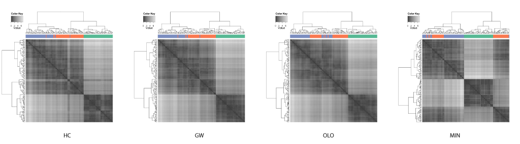
Iris Data
This case study was inspired and adapted from the examples from an introduction to the R package seriation by Buchta et al.[2]. The seriation includes implementations of 2 leaf ordering methods by Gruvaeus and Wainer[3], and Bar-Joseph et al[4].
Gruvaeus and Wainer proposed a method (GW) to order leaves such that two adjacent singleton clusters from separate subtrees are most similar given the constraint of a hierarchical structure.
Bar-Joseph et al. proposed a method called the optimal leaf ordering (OLO) to order leaves such that the Hamiltonian path connecting the leaves is minimized.
The well known Edgar Anderson's iris data set from the R's datasets package is used to compare the results of different leaf ordering methods. The data set includes 50 observations each for 3 species of iris. Each observation contained 4 attributes: the septal length and width, and petal length and width. Hierarchical clustering was performed on the distance matrix (generated using Euclidean distance) with the complete linkage algorithm. The compared leaf ordering methods are the default hierarchical clustering (HC), the GW method (GW), the optimal leaf ordering (OLO), and the dendsort method using the minimum distance (MIN).
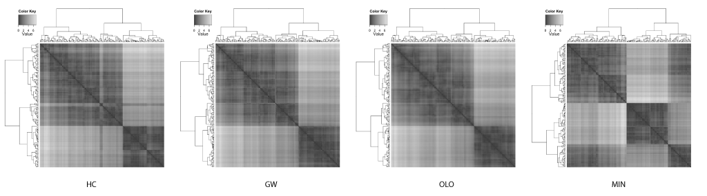
It is quite astonishing that you get different insights when different leaf ordering methods are used. As also pointed out by Buchta et al.[2], you can spot a "light cross" in the HC, and this subtree is rotated and placed towards the right in both GW and OLO examples. Based on the heat map visualizations of ordered distance matrices, both GW and OLO suggest 2 main clusters as two dark squares seen along the diagonal axis, whereas MIN suggests 3 clusters.
Another interesting observation with the MIN example is that you see some observations with unexpectedly whiter regions around the middle of matrix. In fact, this optical illusion is called a Mach band effect, which explains why edges in different shades of gray have exaggerated contrast when in contact. This enhanced edge-detection property of the human visual system works in our advantage in detecting clusters, because of the limitation of our visual systems to decode quantitative / continuous data from different shades of colors [5].
In contrast, the GW and OLO aim to reduce the contrast in the distance matrix. For example, OLO method was designed to minimize the bilateral symmetrical distances, and as a result, more similar or tightly clustered observations are placed in the middle and dissimilar objects are found outside of the subtree[2]. Consequently, it reduces the contrast between two subtrees and the edge detection is compromised.
The homogenizing the linear order of observations encourages a common misinterpretation of dendrograms: one may expect similarity between two observations based on the horizontal proximity [1]. The distance or dissimilarity between two observations are encoded as the height at which two observations merge.
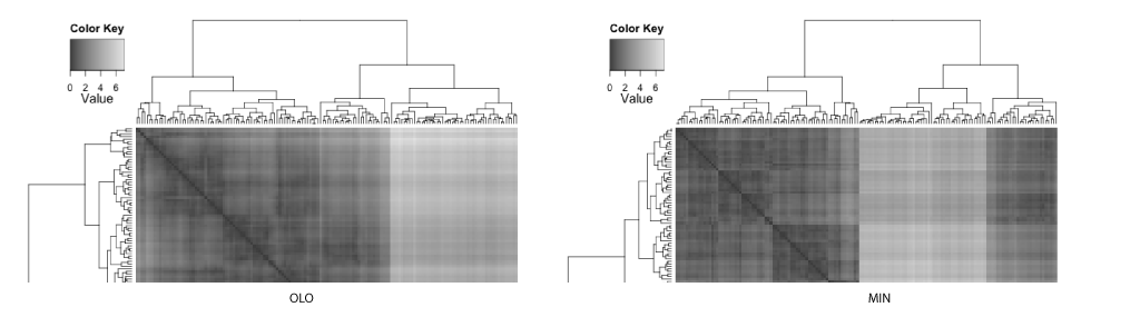
If the clustering results in linear ordering of observations, HC and GW separate iris species more accurately. However, often the task of clustering is to discover subtype and this information about classification is not available. With enhanced edges, the best contrast between clusters are achieved in the MIN example, where the edges in the distance matrix correspond to species.
References
- Gehlenborg, N. & Wong, B. Points of view: Heat maps. Nat. Methods 9, 213–213 (2012).
- Buchta, C., Hornik, K. & Hahsler, M. Getting things in order: an introduction to the R package seriation. J. Stat. Softw. 25, (2008).
- Gruvaeus, G. & Wainer, H. Two Additions to Hierarchical Cluster Analysis. J. Math. Stat. Psychol. 25, 200–206 (1972).
- Bar-Joseph, Z., Gifford, D. K. & Jaakkola, T. S. Fast optimal leaf ordering for hierarchical clustering. Bioinformatics 17 Suppl 1, S22–9 (2001).
- Gehlenborg, N. & Wong, B. Points of view: Mapping quantitative data to color. Nat. Methods 9, 769–769 (2012).
Updated